Rebuilding a fund-transfer journey that splintered across roles into one adaptive solution for every user type.
Business users often lacked visibility into whether a payment had completed, who still needed to authorise it, or what their transaction limits were. I resolved this fragmented, role-based experience with a single adaptive journey grounded in honest status and clearly surfaced limits.
First, a little context
This isn't a normal bank. Designing here means designing for a whole country.
The client is one of India's largest banks (kept unnamed here). Their corporate banking app is a single product that serves everyone, from a solo shop owner to a large finance team with layers of approval. I came in to work on its most critical piece: the payment module, where money actually leaves the account.
a design decision here isn't a decision, it's a policy applied to a nation.
Three account types, a few key roles
The complexity worth showing, and exactly which roles a payment ever touches.
Here's a distinction that shaped everything: the app has three account types, and the bigger ones contain several roles. Only some of those roles ever touch a payment, and those are the ones this project is really about.
The account types
One person owns and runs everything. An OTP is the only gate.
A two-person account, one person initiates, the other approves.
Mid and large corporates, with a whole org chart of roles ↓
The roles, and who touches a payment
| Role | Initiates | Approves | In a payment? | What it means |
|---|---|---|---|---|
| Maker | ✓ | ✗ | Yes | Submits a payment, never completes it alone. |
| Authorizer | ✓ | ✓ | Yes | Approves a maker's payment, but never their own. |
| Admin | ✓ | ✓ | Yes | Highest role in small/mid orgs; executes solo, like a single-user account. |
| Regulator | ✓ | ✓ | Yes | Very large orgs, approves admin-initiated payments. |
| Enquirer | ✗ | ✗ | No | View-only, can see and report, never moves money. |
That single rule meant my "one payment screen" was never going to be one screen. It had to intelligently become the right experience for whoever was in front of it, without ever feeling like a different app.
How might we design this critical journey for millions of people?
Every decision got measured against one question, not "does this look clean," but will this hold up when a shop owner, a startup accountant, and a corporate treasurer are all using it on the same Tuesday? At this scale, restraint and clarity aren't aesthetics. They're responsibilities. This framing is the backbone of everything below.
The constraint that shaped everything: flying blind
A payments redesign with no analytics is a redesign with no map.
Here's the twist: the bank couldn't share analytics data with us. No funnel data. No drop-off numbers. No heatmaps telling me where in the payment flow users were failing. In most redesigns, that data is your map, I had none.
So I stopped waiting for data that wasn't coming and rebuilt the map by hand. If I couldn't measure behaviour quantitatively, I'd triangulate it qualitatively from every human source I could find. The convergence, the same pains surfacing from different directions, became my data.
The bank's business analyst demoed the existing journeys screen by screen, so I could reverse-engineer the current logic and spot the seams.
Interviews with actual business banking customers across the different user types: single-user owners, makers, authorizers.
The unlock. RMs are the bank's front line, hearing every complaint and workaround, a living, breathing analytics dashboard.
Regular sessions to nail the rules, edge cases, and the compliance logic behind every role.
What the conversations surfaced
- Makers never knew if a payment actually went through
- Authorizers judged transactions with almost no context
- Own-account transfers felt needlessly slow
- Finding a payee meant guessing across four search modes
the data gap forced a more human research strategy, and made the problem sharper than a funnel chart would have.
The pain, mapped
Clustered from interviews, RM conversations and the walkthrough, twelve pains across four themes.
🔒 Control wasn't in the user's hands
- No way to set or modify transaction limits
- High-value transfers lacked extra security layers
- Exposure to fraud on exactly the transactions that hurt most
⚡ "Instant" wasn't instant
- Own-account transfers dragged down by needless verification
- Balance updates lagged across linked accounts
- Internal transfers slow despite being inside one bank
🌫 Users were left in the dark
- Inconsistent status, "did it actually go through?"
- Poorly categorised transfer history
- Makers got nothing after handing off for approval
🧩 Everything was scattered
- Poor multi-account view (savings, current, FD)
- Weak payee management, confusing 4-mode search
- Unclear fees → surprise charges
Seven roles, three journeys
The trap was designing a separate experience for every user type. Instead, I clubbed all seven into three shared journeys.
Look closely and the payment paths overlap almost entirely, the only real difference is what a person is allowed to do. So I collapsed the whole role matrix into three journeys everyone shares: initiate-and-done, initiate-for-approval, and approve. One system to build, one mental model to learn, no seven near-identical flows.
(Enquirers see everything and touch nothing, view-only, by design.)
Pain point → solution
Each research pain, the real screen that answers it, and why it works for users and the business alike.
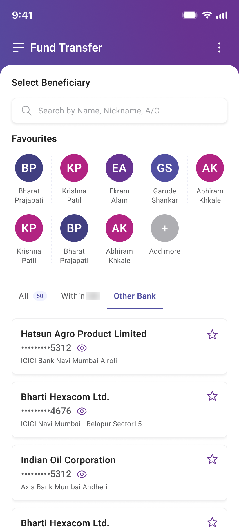
Lead with “who,” not “how”
The old app opened with “pick a transfer type,” then a four-mode account search. I flipped it, you start by choosing the payee, from favourites or one smart search, with the transfer type as a filter. Own accounts sit under a pre-verified own-accounts tab, so routine transfers stay instant. This became the shared spine for every journey.
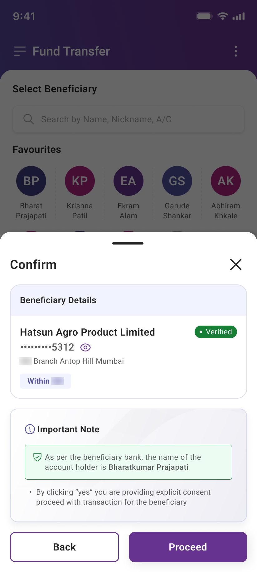
Verify before a rupee moves
Before any third-party payment, the beneficiary is verified, the screen confirms the real account-holder name from the receiving bank and asks for explicit consent. A quiet, high-trust checkpoint on exactly the moment fraud tends to strike.
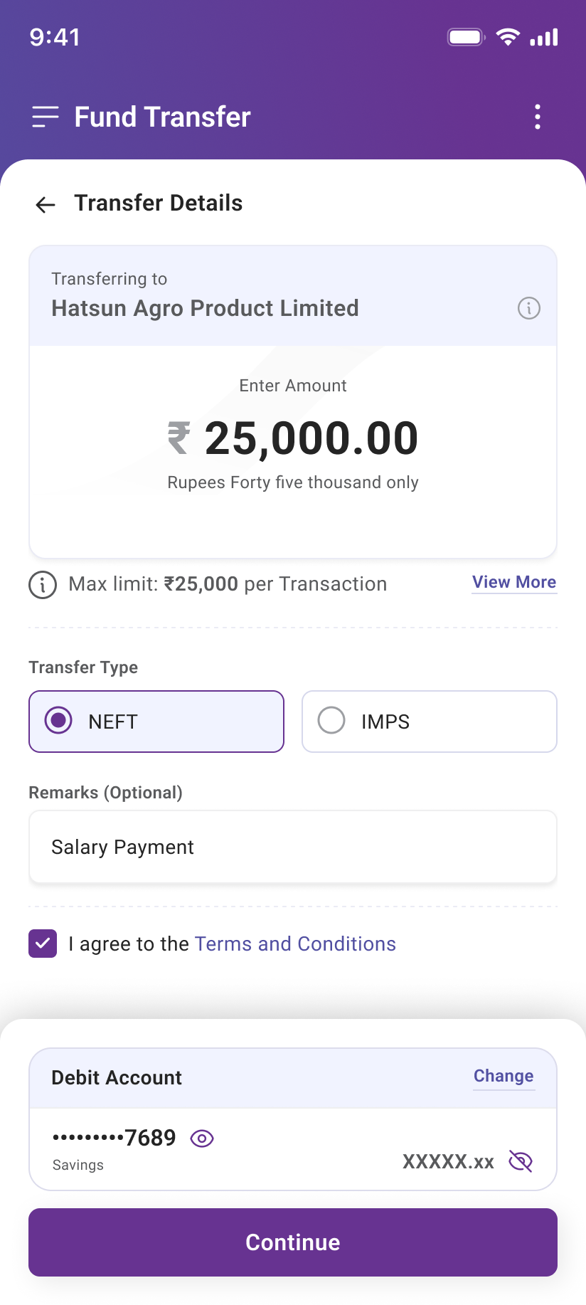
Clarity before you commit
The transaction limit sits right above the amount, the amount echoes back in words, and charges are stated up front. Three quiet moves that prevent failed high-value transfers and surprise fees before a single rupee is entered.
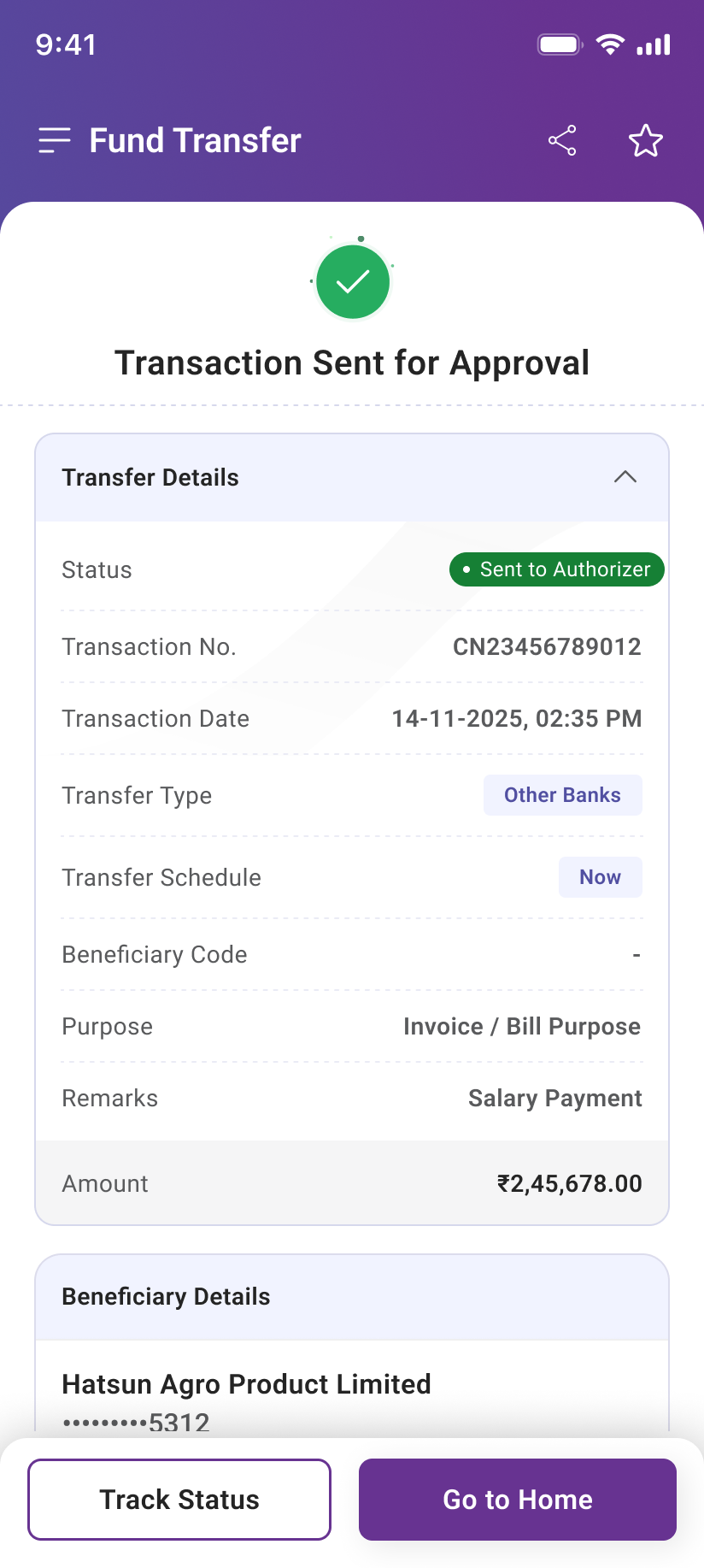
The ending that tells the truth
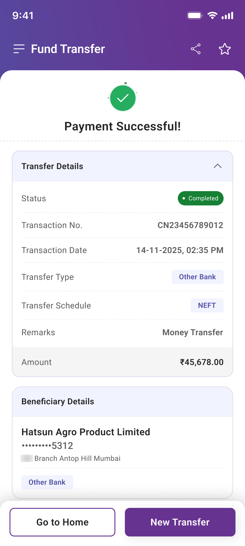
The old flow authenticated, made the maker tap confirm again, then showed “Successfully completed → Sent to Authorizer”, completed and awaiting-approval at once. I made the ending honest for each role: a single-user account holder who executes alone sees a true Payment Successful; a maker sees Transaction Sent for Approval with a Track Status button. The same honesty holds at every level, a Level-1 approver who passes a payment up sees “Sent to Approver,” never “success,” until the money truly moves.
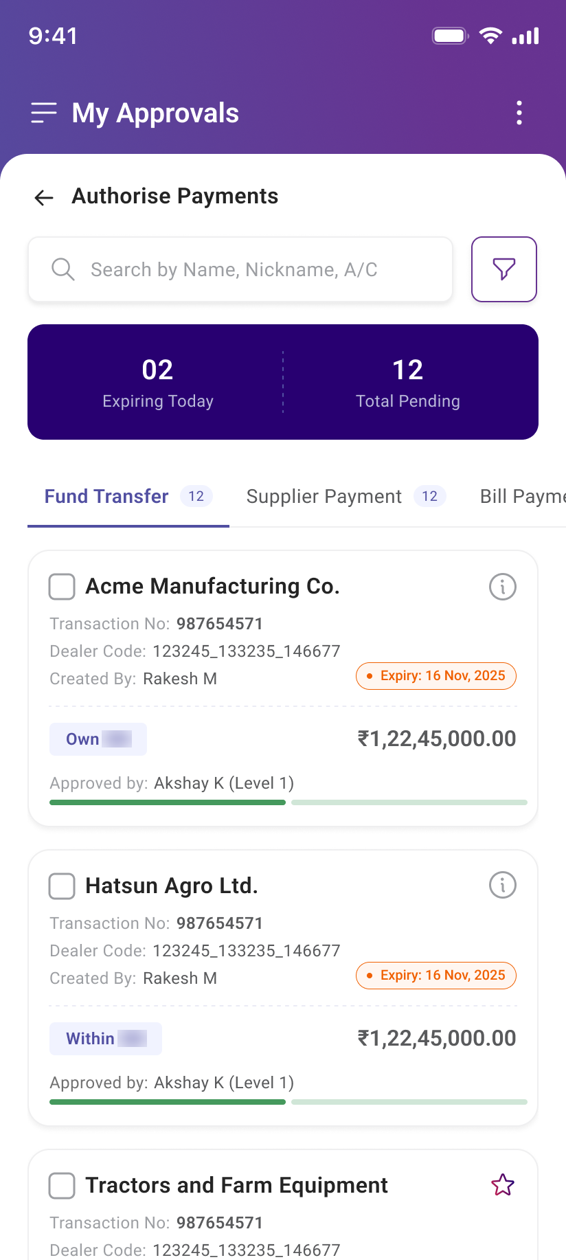
A cockpit, not a list
The approver is the control gate, but the old queue gave them almost nothing. The redesign is a triage cockpit, “Expiring Today / Total Pending” up top, filters for amount, type, date and approval level, and multi-select bulk approve, reject or reschedule. The detail view finally shows the maker, purpose, amount and debit account, and a rejection now captures a reason and notifies the maker.
See it actually work
The two journeys, end to end, the maker sending a payment, and the authorizer clearing the queue.
From uncertainty to confidence
The journey is in development, so here's the before → after in experience terms, and the outcomes I'd validate.
- "Did it even go through?"
- Approvers deciding blind
- Guessing across four search modes
- Own transfers slowed by verification
- Rejections that vanished silently
- Honest status + Track Status
- Context-rich, bulk-ready approvals
- Beneficiary-first, one search
- Instant, pre-verified own transfers
- Reasoned rejects that notify the maker
Four things this taught me
Scale is a long lever
One small decision, multiplied across a nation, clarity becomes a responsibility, not a nicety.
A data gap is a research strategy
No analytics pushed me to people, users, relationship managers, the business, for a sharper, more human map.
In enterprise, the rules are the UX
Separation of duties isn't an obstacle to hide, it's the product to make legible.
One flexible system beats seven rigid ones
A shared spine that adapts serves everyone, with far less to build and maintain.
Where this goes from here
One adaptive entry point for every role, the last piece of the unified experience.
Replace the projected targets with measured results from moderated sessions.
Roll the beneficiary-first spine across the remaining payment categories.